Written by Mike Carter, Hull KR Shirts.
For the second year running, Hull KR has revealed a shirt for the following year before the completion of the current season. The feel-good factor around Hull KR at the moment is at an all-time high during the Super League era, and the club has once again taken the opportunity to bounce off the positive momentum in East Hull.
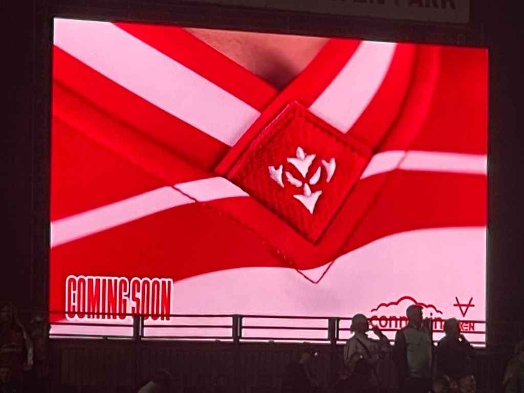
Those who stayed back after the final whistle following the Robins 26-16 victory over Leeds Rhinos on 20th September will have seen a ‘coming soon’ teaser on the big screen at Sewell Group Craven Park. The graphic featured a V-neck collar with an embroidered diamond shaped patch hosting a Robin Icon – a giveaway indicator that a shirt reveal was imminent.
Supporters also began to notice a pre-order holding page on shop.hullkr.co.uk that allowed you to pre-order a shirt ahead of the full release. A tactic that Hull KR have effectively deployed on many occasions in the last few years.
To most, this might have been the first clue with regards to the identity of the 2025 home shirt, but to me, it wasn’t. I didn’t say anything at the time, as I was curious to see if anyone else would let on to me regarding this, but no one did. Back in August, Hull KR announced an extension with OXEN until the end of 2030, and with the announcement was a video montage of the memories both Hull KR and OXEN have created together.
A message at around 1:14 in to the video reads “our past, our present, our future.” As the words “our future” appeared, so did a red OXEN logo on a white shirt. If you look closely, you can make out a little bit of red in the top right corner of the image below. Now, I know that was part of the broken-sash design, however, at the time, it was almost impossible to be sure what it was, but it was certainly intentional that the red could be seen.

(Credit: Hull KR)
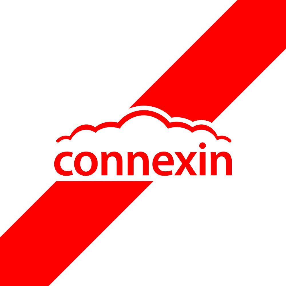
Our next teaser was provided to us by principal kit partner Connexin. On Saturday morning, they updated their profile picture on their social media channels to a white graphic with their Connexin branding appearing in red, with a broken-sash styled band, travelling from the top bottom left to the top right, or the other way around if you prefer. A clear hint that the 2025 Hull KR home shirt was going to feature a sash…
(Credit: Connexin)
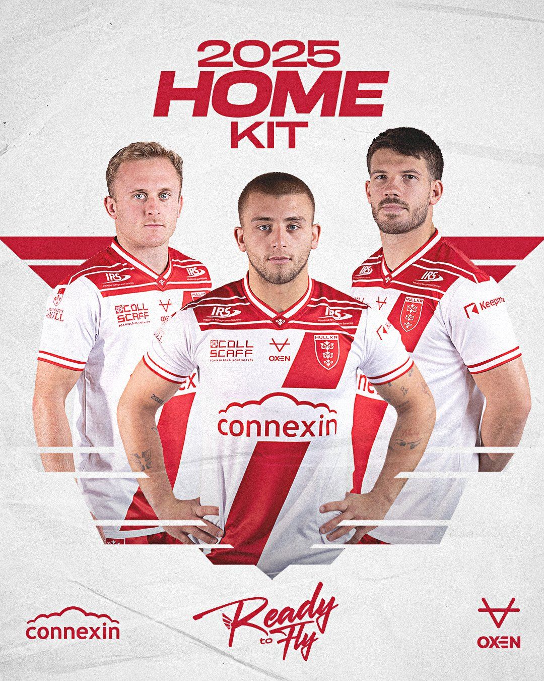
Ready to fly
At 10:00AM on Saturday 21st September, the full reveal commenced with promotional graphics being uploaded to all official club channels. This coincided with the club shop opening its doors, with the brand new kit on display and on sale, ready to be purchased there and then!
(Credit: Hull KR)
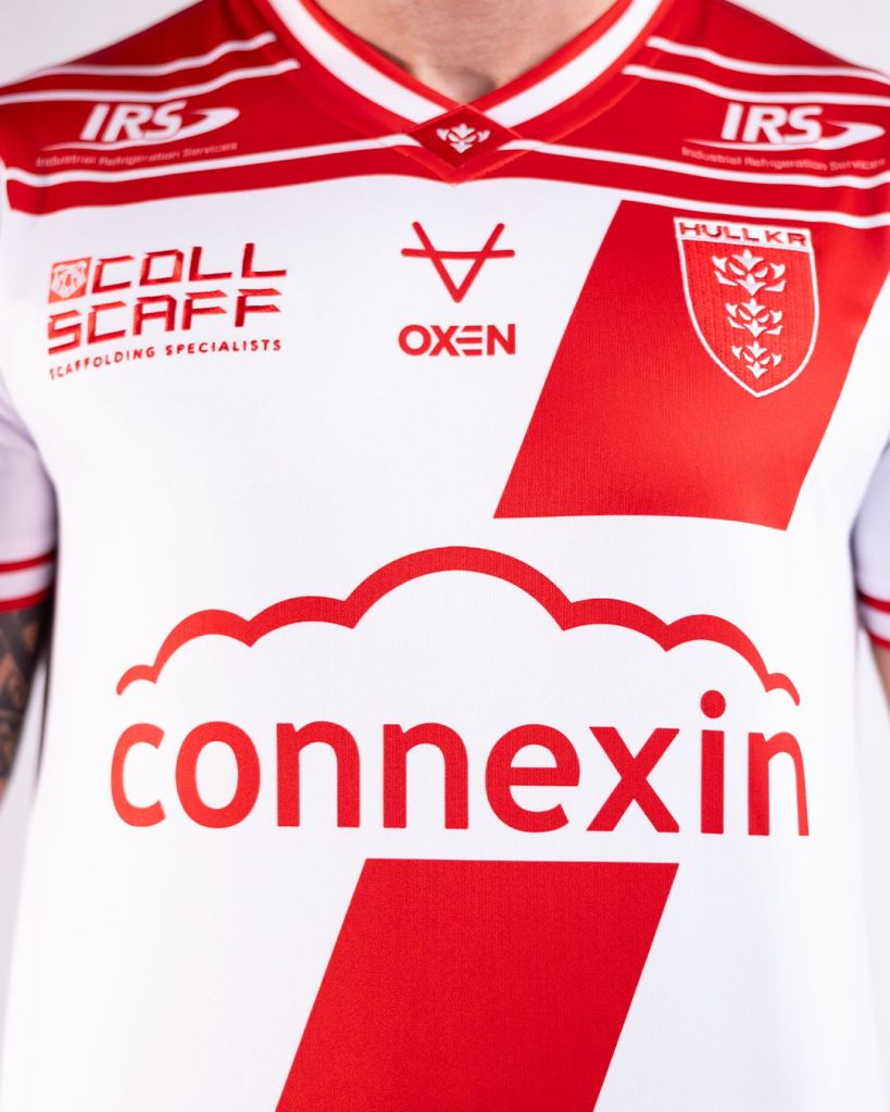
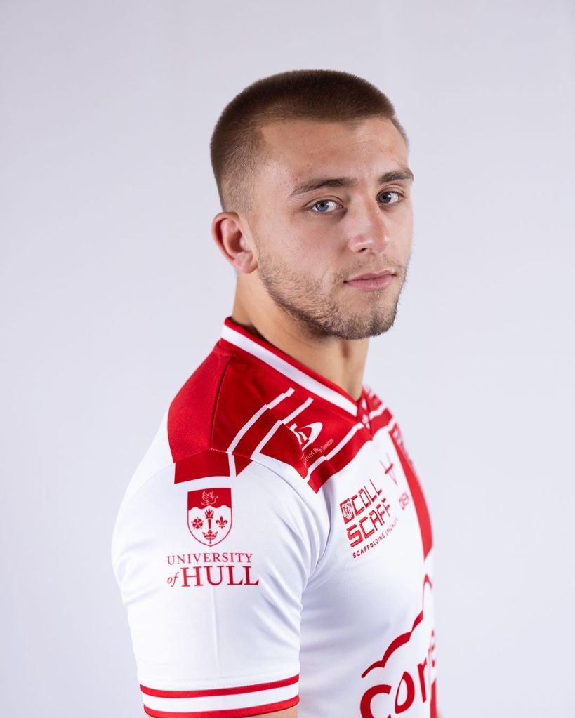
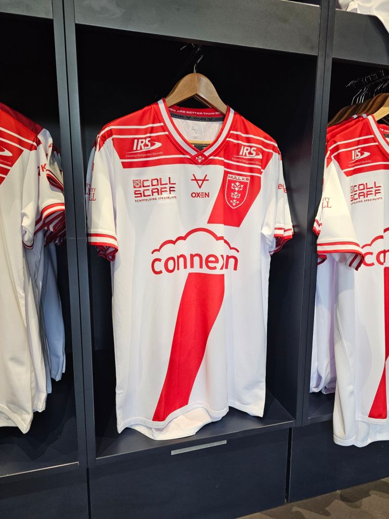
The shirt consists of a white main body panel with a broken red sash that travels from the upper left as wearing, heading towards the waist on the lower right side of the shirt, only giving way for the Connexin branding. We’re so lucky to have a principal sponsor like Connexin, who has a fantastic logo and is so willing to work with the club on how it is featured within the shirt design.
The 2025 home shirt is only the second time we’ve seen a variation of a sash on a Hull KR playing shirt, the other being the 2011 home shirt, which featured a placket.
(Credit: Hull KR)
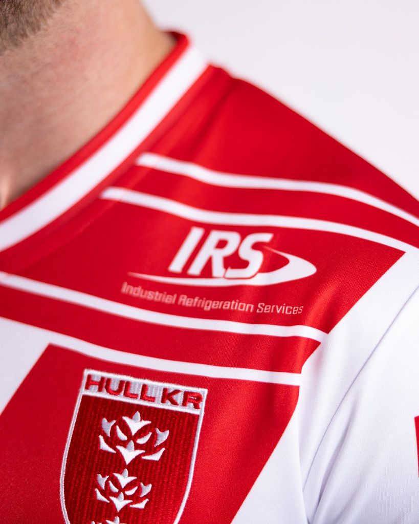
That isn’t the only design element of the shirt though, as we have some front panel shoulder into upper chest detailing, too. The blocked red panel is broken by 3 white bands, going across the shirt, leaving enough of a gap for long-standing sponsor, IRS to appear within it. I’d be very interested to know if the club considered just going with one of the two main design elements or not…
(Credit: Hull KR)
Some supporters have noticed that the shirt design resembles a number 7. That has sparked comments that this is a tribute to Rob Burrow, in a similar fashion to the shirt that Leeds Rhinos released for Magic Weekend in 2022. It’s clearly there. Everyone can see that, but I don’t know how intentional it was. Hull KR hasn’t pointed it out in a manner that confirms or denies anything, so as supporters, I believe that it should be up to us to decide what we feel it may or may not represent.
Beautiful embroidery
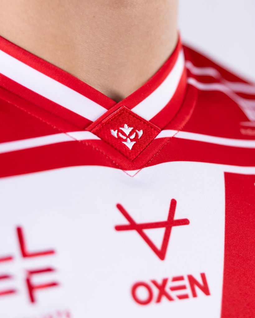
The collar and cuff work on this shirt is absolutely excellent and is by far my favourite element of the kit. The collar has to be one of, if not the best collar on any Hull KR kit. Sitting centrally as the layover collar meets on the upper chest is an embroidered red diamond shaped patch featuring a white Robin icon. This is a fantastic placement, and it introduces the icon to the front of a playing shirt for the first time… Side note: How long will it be until we see the icon used instead of a crest on kit?
(Credit: Hull KR)
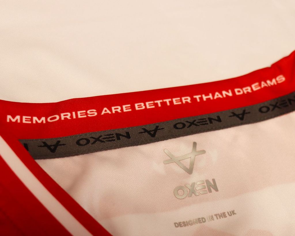
Next, we have a lovely touch to the late, great Phil Lowe in the inside collar. One of his quotes, which in recent times the club have adopted “Memories are better than dreams” features inside the collar, so where ever we go next, Phil will always be with us!
(Credit: Hull KR)
There are a few new sponsors on the 2025 home kit, with one of them appearing on the shirt, and that is Collscaff, who takes the right side as wearing chest placement. Collscaff has sponsored the club in many ways in the past, including the player sponsorship of Mikey Lewis for the last few seasons, as well as matchday sponsorships, too. It is welcoming to see a local sponsor seeing the value in taking up a spot on a Hull KR playing shirt for the very first time.
As previously mentioned in almost every review that I have written, I must give huge thanks to all the sponsors who have allowed their branding to be modified to increase the aesthetic appeal of this shirt. Your unwavering desire to support kit design does not and will not go unnoticed. Eternally, thank you!
Futuristic wing design…
The shirt has white set in sleeves, where a small amount of shoulder detail carries over. When I say a small amount, I do mean a small amount. There are certain restrictions in play when it comes to sleeve detailing, mostly due to sponsor placement, but this is where the winged element of the shirt should have come into play more for me. Within the description of the shirt, it is mentioned to be inspired by a “futuristic wing design”, and whilst I can see it, when you factor in the upper chest and shoulder detail, the sleeves need to somehow play a bigger part, in my opinion, even if the design is broken for sponsor placement in a similar fashion to the sash on the front. The message and design could have been more powerful in its delivery.
(Credit Hull KR)
Once again, there is no competition patch on the 2025 replica shirts. I assume this is in line with some potentially unknown status around the competition name beyond 2024. It has been speculated that at some stage in the future, the competition could be renamed.
The back of the shirt features two more long-standing sponsors of the club. Harrison Solway takes the space above where the players name and number will be applied, with Hirebase having the logo below. The wing design crosses over to the back of the shirt. This is where the Robin icon is housed in its usual nesting place.

(Credit: Hull KR)
Upon the release, the tagline used was “Ready to fly” a wonderful play on words for a club nicknamed The Robins, coupled with the on-field and off-field successes, including the club taking on multiple global expansion projects. One of those is the RugbyLeague.com Amsterdam Challenge, a fixture that will take place in January 2025, a game that will see the Robins wear this shirt for the very first time.
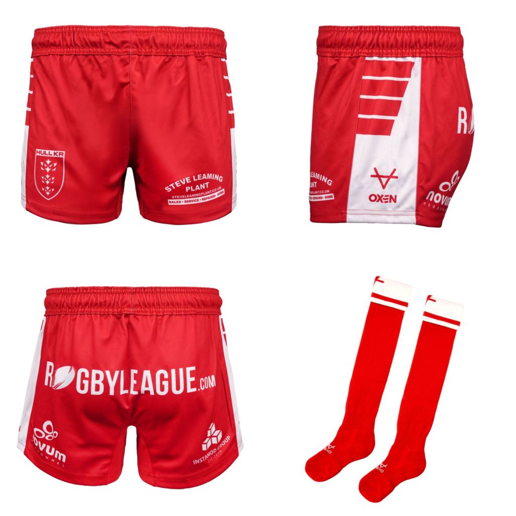
Completing the home ensemble are red shorts, with white side panel ‘wing’ detailing and red socks with a white turnover with a red band featuring the OXEN icon above the band. The wing design on the shorts is much more effective than it is on the shirt. Steve Leaming Plant and Instamod both return with the addition of Novem and RugbyLeague.com appearing as sponsors on the shorts. The additional sponsor on the shorts for the 2025 season sees OXEN move their branding to the side panel.
(Credit: Hull KR)
I’ve spoken in the past about sash shirts not really being for me. I can’t quite put my finger on why, but I’d much prefer a plain shirt or a shirt with a band. The wing detailing and collar work are wonderful, though. They’re so much better than the grandad collar on the 2011 home shirt. That alone could make it far more appealing than it maybe should be.
I always struggle to get my head around the “it looks like *insert team* comments.” Yes, Salford used a sash in 2024, but are they the only ever team to use it? This shirt was well into its design and production before that Salford third shirt came out. In a world where the commercial side of the club requires kits to change year on year, coupled with the fact there is only so much you can do with red and white (and occasionally blue), there is going to be times where a shirt looks like something that’s come before it. Kit design is tough, the demographic is so huge you can’t please everyone, but it appears more people like this one than they dislike it, so I think the club will be very happy with that.
Will the 2025 trio be better than the 2024 kitset?
Hull KR and OXEN do an incredible job of giving us some variation in our kitsets. Look at 2024. They compliment each other so well and provide us with a kit for every single opposition without developing a single kit clash. I’m not quite ready to let go of the 2023 trio yet, let alone the 2024 one! They just come out so quickly. As the saying goes, time flies when you’re… Winning games!
Shortly after 4:00PM on release day, Hull KR shared an update on their sales so far. Within 6 hours of the reveal, they were already 167% ahead of the comparative stage for the release of the 2024 home kit, a home kit that was one of the best that we’ve had in the modern era and is quite possibly the best selling Hull KR home shirt ever!
This really is incredible stuff from the Red Army, when you consider that supporters have the pending Awards Evening, a Play-Off Semi-Final, and a potential Super League Grand Final to pay towards and that’s not even considering the Amsterdam Challenge, in the not too distance future. That’s only thinking about the financial demands that come with being a Rugby League fan, too. As we know, there are many, many more factors that should be considered.
You may have noticed a £2 increase in the price of an adult shirt ahead of 2025 to £51.99. This was covered by Craig Franklin at the most recent supporters council meeting in September 2024. The following note form quote was taken from the published notes “The increase on kit will be, replicas £2 adults, costs have increased, including shipping costs but compared to other club shirt costs we are the 3rd cheapest, Leigh’s cost is £47. Hull FC adult replica shirts retail at £52.99, Hull City replica shirts are £55, Wigan and Leeds are £52.” I think it is to be understood that the price has risen slightly, but that doesn’t appear to be putting too many people off in the early stages of its availability.
I’ve come to the early conclusion that I don’t mind it. It hasn’t immediately grabbed me like the 2024 home shirt did. That one is incredible and always will be. Even more so if.. No, I won’t say it. This shirt has plenty of suiters, both in the form of online interaction and sales. However this is just one of three kits that Hull KR will wear next season. As we’ve become accustomed to, the Robins will once again have a trio of shirts to call upon for the 2025 Super League season. We’ve seen the home, and if you’ve been in the club shop recently, you may have stumbled across a clue at what one of the alternate kits may look like…
Whilst you’re here, take a look below to see what else is happening at Hull KR Shirts HQ…
