Written by Mike Carter, Hull KR Shirts.
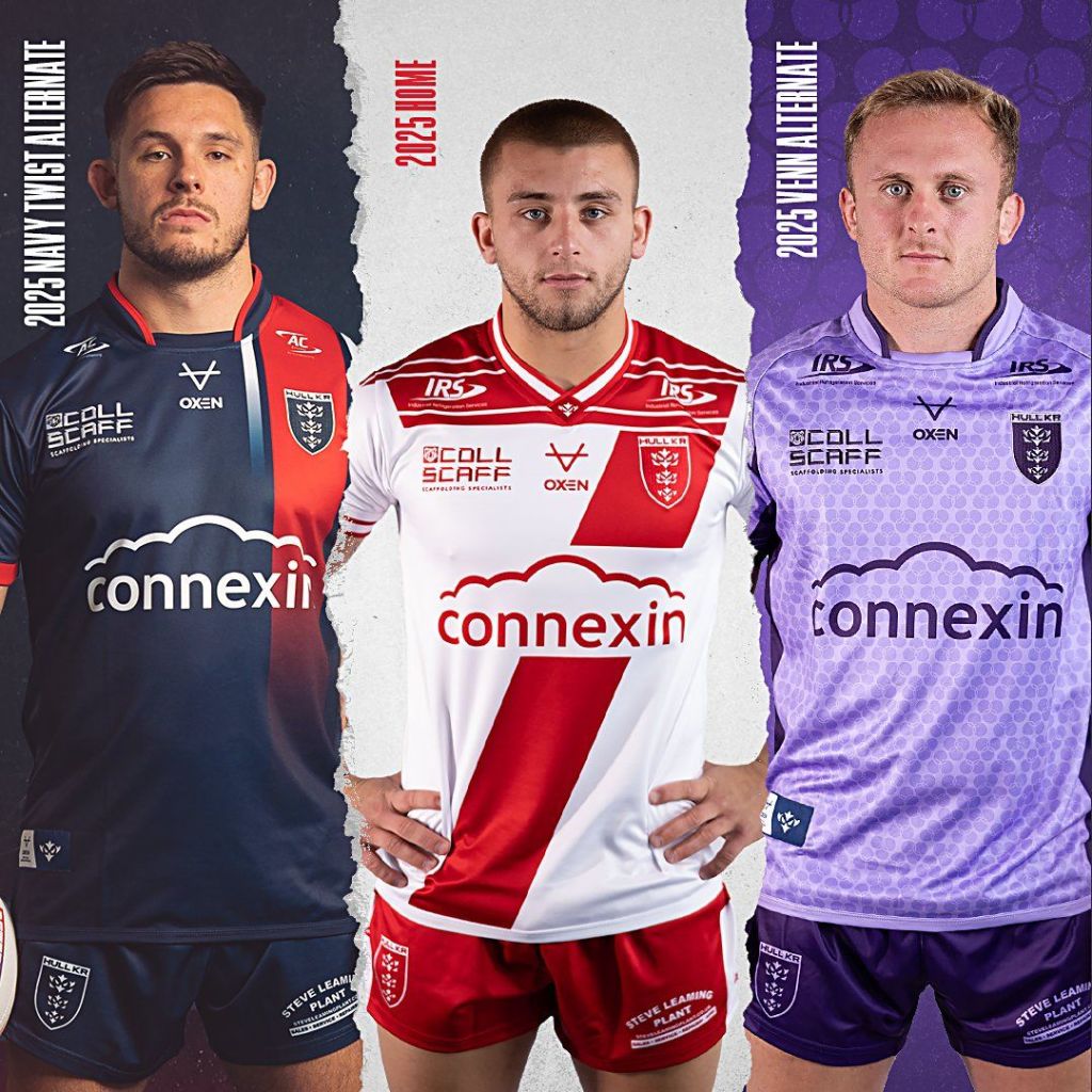
We now know what the trio of Hull KR kits for the 2025 season look like. The kitset was rounded off nicely by the reveal of the ‘Navy Twist’ alternate kit on Thursday 7th November, marking the third year in a row that Hull KR has had all three kits on sale ahead of Christmas, and the inevitable rush from supporters to get presents under the tree ready for the big day.
I always knew that on the kit front that it was going to be a difficult path out of 2024 for Hull KR. I would almost have almost called it an ‘impossible task’ to top the trio of 2024. I think the kitset for 2025 is weaker than the 2024 trio that it is replacing and I don’t envisage many people arguing against that, however, I do believe the club has been able to navigate the waters fairly well, by delivering a trio that complement each other and tries to offer something for everyone.
Let’s get into the reveal process. A post on social media was shared that announced that Keepmoat will continue their partnership with Hull KR into the 2025 season. Accompanying an article link was a photo of Keepmoat branding on a yet to seen Hull KR shirt sleeve. Right away supporters were questioning if this was the start of the reveal process for the final kit of the 2025 season, and they would be right. The confirmation for this, if you needed it, was within the article that was linked to the social media post.
There was a further teaser, and that came via Keepmoat over on their Facebook. I think this one was missed by most people, me included at first – until someone pointed me in the direction of it. It showed more of the sleeve featuring the Keepmoat branding and invited us to take in the lovely red cuffs that feature on the Navy Twist shirt.
The third and final tease came via a video, which was like an animated GIF in its appearance. It was posted by principal partner Connexin, with the tagline, “Traditional with a twist.” The animated image showed a red band going across the screen, that had two white bands either side of it, rotating 90 degrees from landscape to horizontal, with the Hull KR club crest appearing within the red band. Connexin’s branding also appeared during the transition. The twisted band started out solid at the top and gradually faded as it travelled down the graphic.
Traditional With A (Navy) Twist…
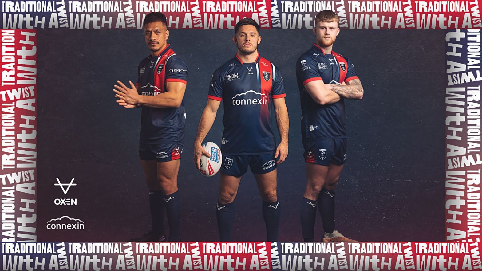
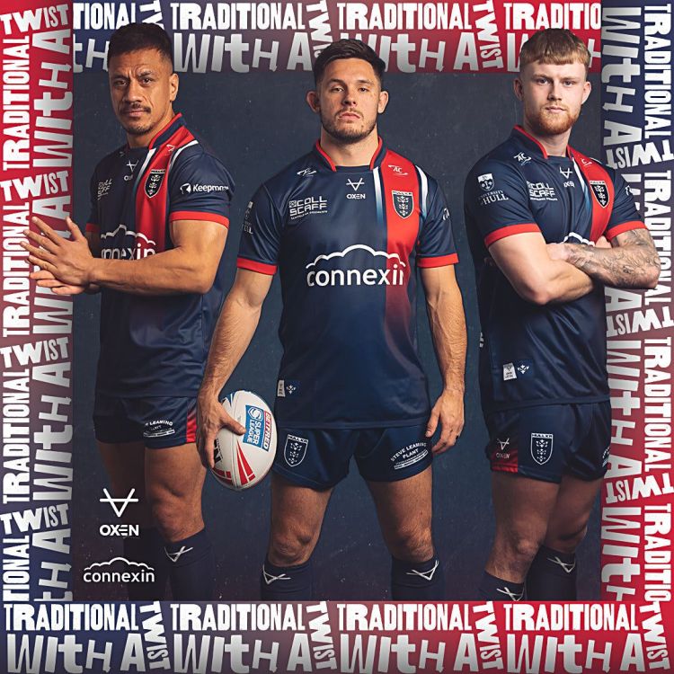
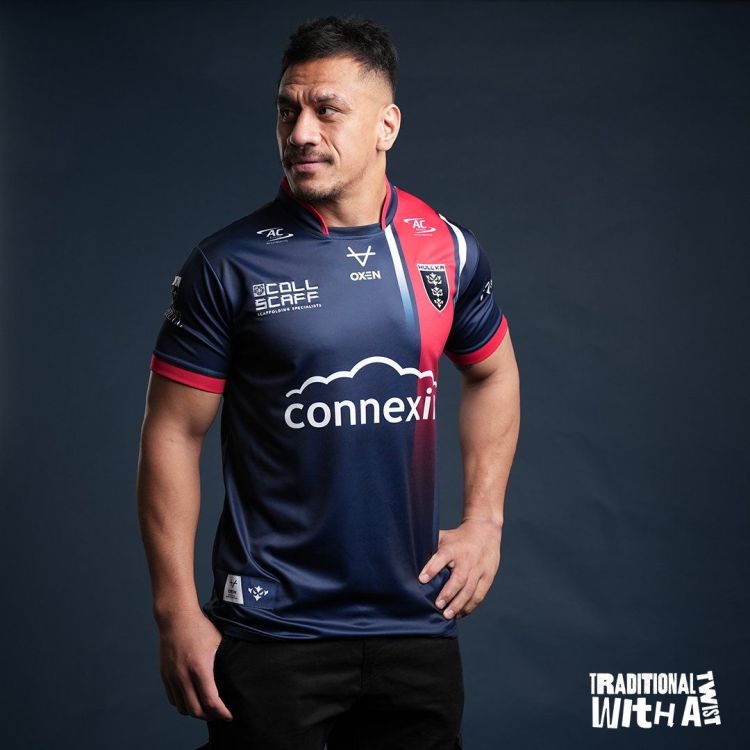
That was the last of the teases before the full kit reveal that came at 6PM, one of Hull KR’s favourite time slots for communicating to their fanbase. You already knew that, though, right? The full kit was on show, so this time around, we can call it a kit reveal. The kit was modelled by Sauaso Sue, Niall Evalds and Connor Barley, who all looked fierce yet compelling in the latest pieces of Hull KR merchandise.
The launch was coupled with a video that was created by Lewis Robinson. You can check out his work here. The video is a fast moving, transition based piece of media that allows you the opportunity to see various elements of the kit and then finishes with a promo image to allow you to study the strip in greater detail. You can watch the video here. The video also includes a look at the Navy Twist hoody, too. More of this is coming…
I think the first thing that most people thought when they saw this kit was that it looked like a Paris Saint-Germain (PSG) kit. I actually thought this from the very first image I saw of the Keepmoat branding, as you can just make out the red and white in the image. If you’re either a football fan or have general kit knowledge you might have been aware of what PSG’s home kit for the 2023/24 season looked liked and if you didn’t you do now, as it is almost identical. However, there are some subtle differences, which is where I come in…
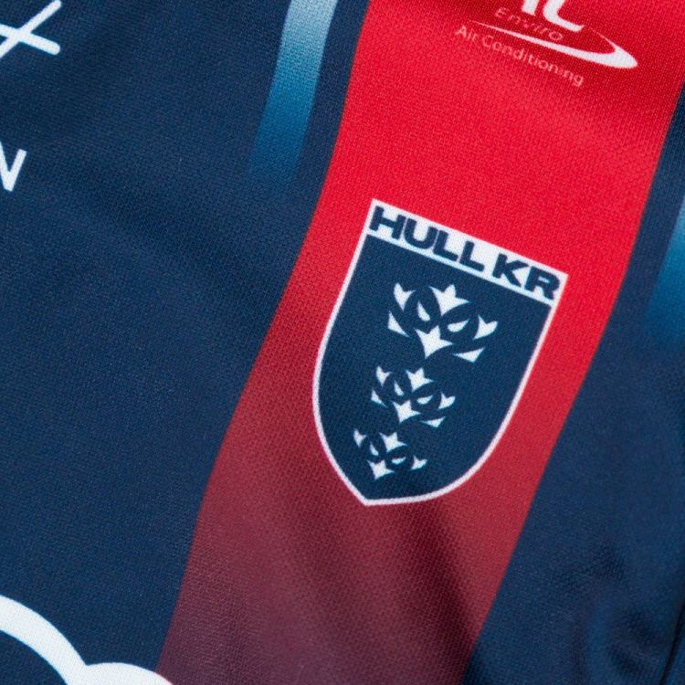
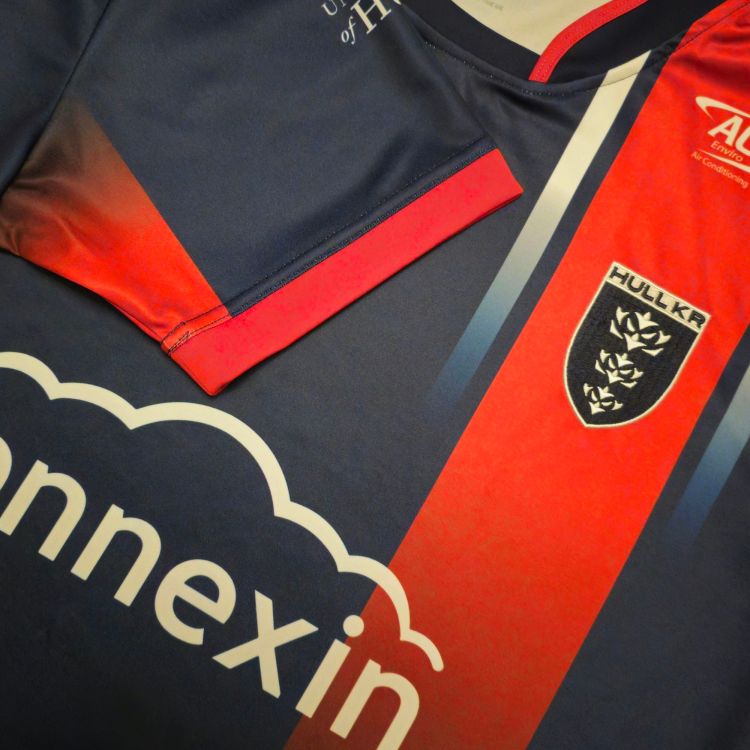
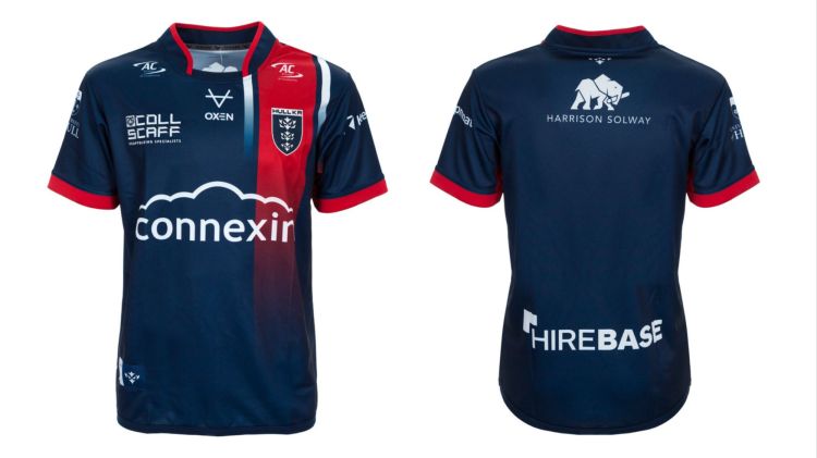
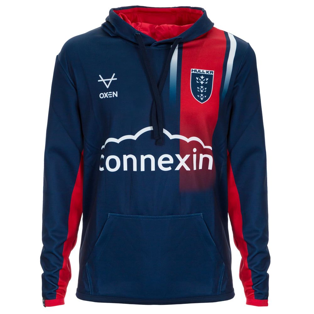
Within their press release, Hull KR said, “The navy blue shirt features our famous red band which has been seen on kits throughout our history and is a traditional colour combination for the Robins. However, this time the band has a twist, switching to a vertical stripe symbolising the forward trajectory that the club are on.”
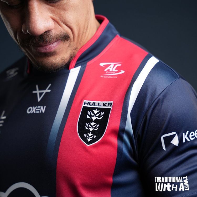
To add a little bit more detail to this, the twisted red band is a gradient band, meaning that the red fades (or bleeds) into the navy of the shirt, giving it a pretty cool look, since the band doesn’t travel all the way down to the bottom of the shirt. It also features two white gradient bands on either side of the red band (with a small gap between them) that travel just past the crest before fading into the main body of the shirt.
Axilla Gradient Fade
This isn’t the only gradient fade on the shirt, though there are two more on the axilla areas of the shirt. Axilla is Latin for “underside of an upper wing or arm”– thanks for that, Les. See, I do listen! It is basically a much cooler way of saying the armpit. It is really hard to see this on the graphics, and it is much more visible when you have the garment in your hand. The gradient fade is reversed here, meaning the red is deeper towards the cuff, and the fade is where the sleeve meets the body. In recent seasons, we’ve used the sleeve space to add some fantastic detailed elements, and this one is no different. I love it!
In the OXEN-era, we’ve used navy effectively well. The 2025 Navy Twist will join the 2024 Marble, 2023 Diamond and 2020 away as excellent uses of the colour navy. It is hard to believe that a colour that has become so popular as an alternate colour for Hull KR didn’t actually appear as a main colour until 1996.
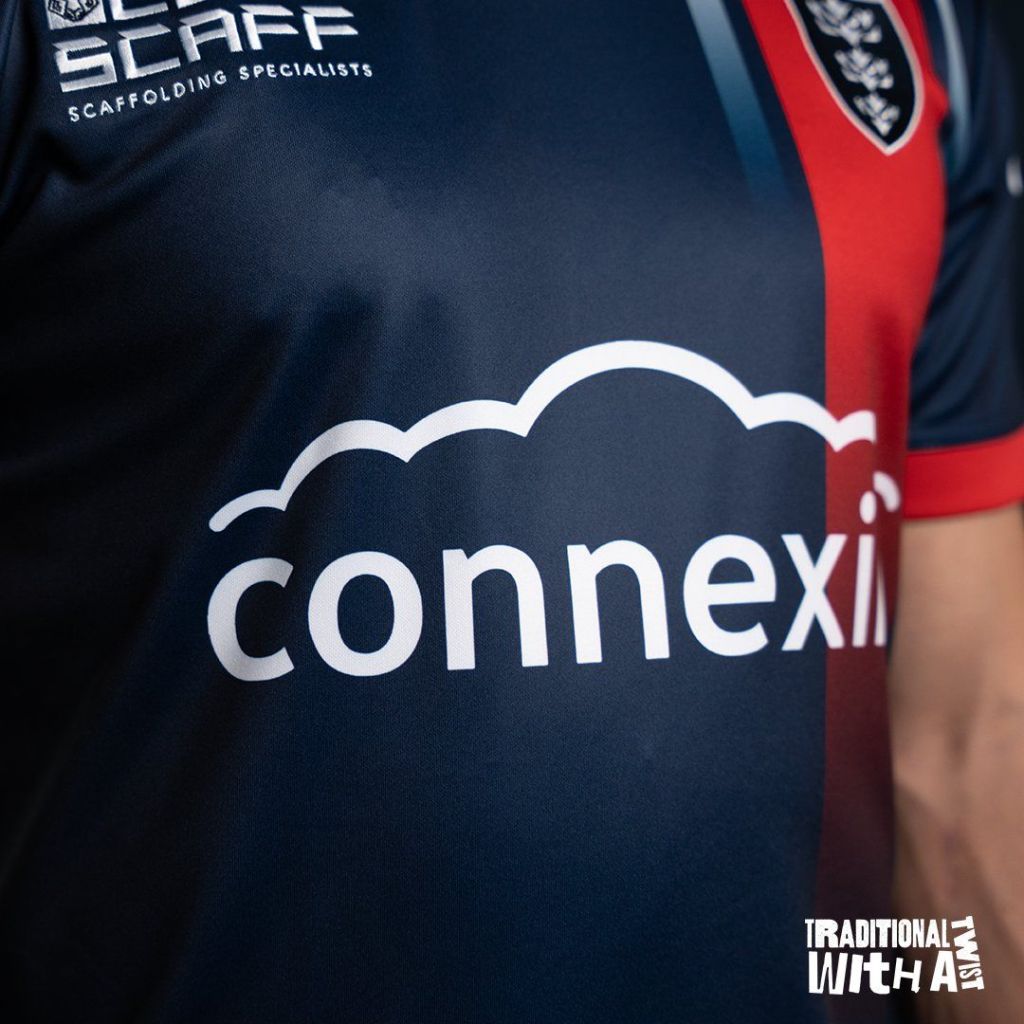
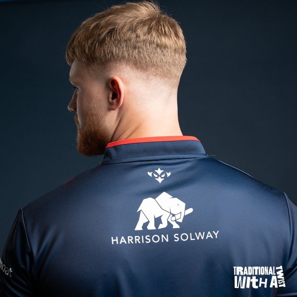
Once again, the kit features stupendous sponsor integration from all the brand partners of the club. Connexin and OXEN are proving to be a wonderful combination for Hull KR followed by Collscaff, Harrison Solway, Hirebase, IRS, Keepmoat, AC Enviro and University of Hull who all have their branding on the shirt in white. Also in white, but this time RugbyLeague.com, Novum Personnel, Instamod and Steve Leaming Plant signed off their branding to feature on the shorts.

As mentioned, all of the sponsors and the OXEN icon on the socks feature in white, on navy shorts. Yet again, the design element of the shorts is housed in the side panel. The gradient fade from the axilla is duplicated on both side panels of the shorts, with the OXEN logo laid over the top.
Roosters In Paris?
Is it possible that Shaun Kenny-Dowall and Jared Waerea-Hargreaves played a subconscious part in the design of this kit? The colour combination of the kit is one commonly used as primary colours for Sydney Roosters, a team that SKD played for on 224 occasions with JWH racking up a whopping 310 games. Consider this, and the location where SKD and JWH were when ‘Agent SKD’ planted the seed for his former teammate to join the Robins… Magnifique!
Also, a part of the launch was the 2025 Navy Twist Hoody. This is the first time we’ve seen one of the shirt hoodies launched with the shirt ahead of 2025, and it appears to have been super popular! The red gradient fade starts at the cuff on the hoody and works its way up to the forearm. It is much more visible on the hoody than the short sleeved shirt due to its positioning. The hoody is also much cleaner with it just featuring the club crest, OXEN maker marker and Connexin as the main sponsor. Just to show you how popular it has been, it has sold out in sizes Small-3XL just a few days after the launch. This hoody is built like the shirt hoodies were last year. It is a thinner material, and not like a traditional hoody.
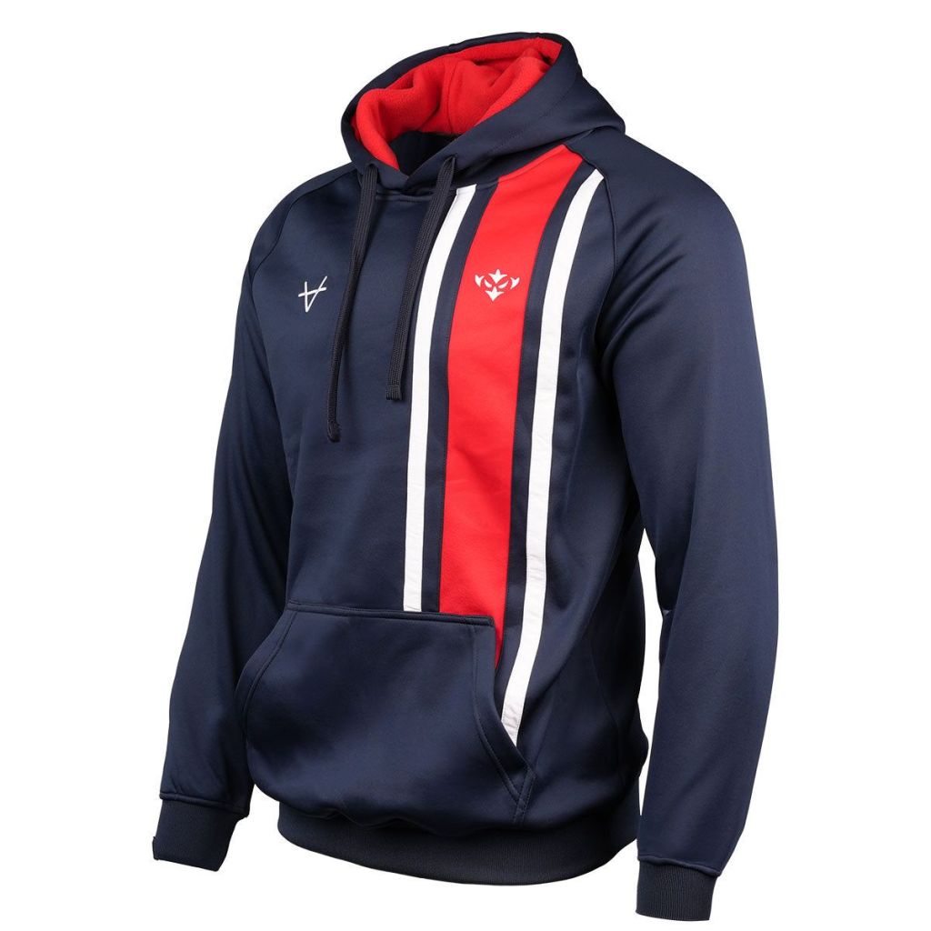
It doesn’t stop there, though. There is a second hoody available, called the Navy Twist Icon Hoody. I haven’t seen Hull KR mention or promote this one on their social media channels, but I found it online on one of my many daily searches. This just features the Robin icon and OXEN’s icon, along with the twisted band, however, there is no gradient fade on this one, with both white and the red ‘bands’ continuing until hitting the front pocket. Looking at the images available, this one looks to have the been given the traditional hoody build – this is probably the one I will buy.
I quite like the Navy Twist kit. I am slightly torn on which I prefer more, though. It is between this and the Venn for me. I will need to see the players wearing the player specification version of the home kit to really up my interest in the design of that one, though. The trio we have all compliment each other well. We have something that we can wear against any club in Super League without causing any unnecessary clashes. It is safe to assume we will wear the home kit in every home game in 2025, as well as in the Amsterdam Challenge, but the combination of the Venn and Navy Twist will allow us some lovely alternatives for fixtures on the road.
Judging from the online reaction, it seems like the Navy Twist is going to be THE shirt of 2025. The buzz around its reveal has been excellent, as was the application of the reveal. The shirt, the video, the launch, the club… Grade A! I love the way that not only the full kit was shown, but the shirt was worn by Sauaso Sue with a pair of casual bottoms too, since that is what 95% of us will wear it with!
Whilst you’re here, take a look below to see what else is happening at Hull KR Shirts HQ…
