Written by Mike Carter, Hull KR Shirts.
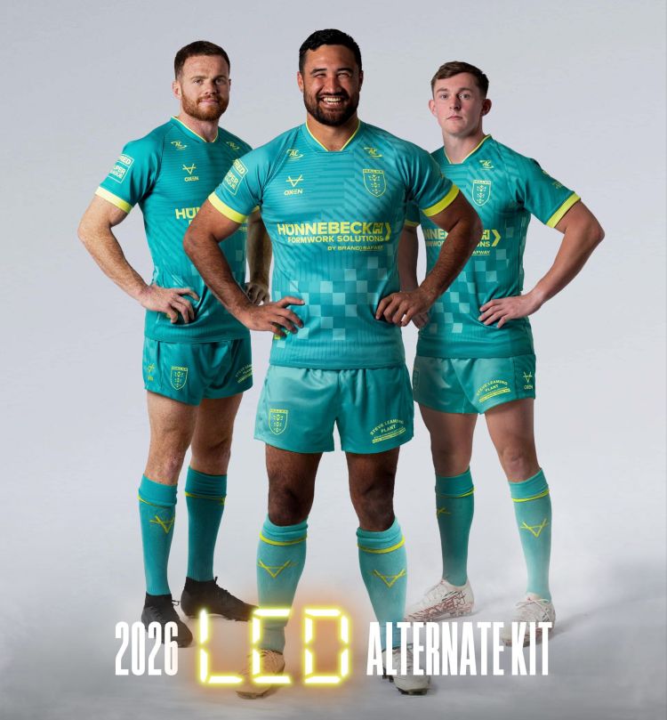
Something happened on Monday 17th November that doesn’t happen too often. Hull KR opened up to what many believed was a mistake when designing the LCD alternate kit. When the kit was revealed on Thursday 23rd October, the teal and yellow shirts were accompanied with florescent yellow shorts and socks. The initial reaction from those who vocalised an opinion was that the shirt was good, but the shorts and socks just didn’t work as intended.
In my original article (which can be found below), I wrote “What on earth is going on with those shorts and socks?? They’re horrendous!”. That was me trying to be constructive and nice about it, too. It just didn’t work as a full kit, in my opinion, and that turned out to be a shared concern that caused Hull KR to take immediate action.
In a statement published to hullkr.co.uk and social media, Hull KR confirmed that they’d taken action to replace the yellow shorts with teal variants. The statement was titled “We agree, we’re not sure on the shorts now either, so…” and it opened up with “…we are going to change them” – this is a really interesting decision, as it opens us up to the knowledge that the driving factor behind the change was the supporter reaction after the launch. In the statement it addresses that the reason for the change is purely based on aesthetics and not retail sales, offing those who bought the original yellow shorts a pair of teal shorts for no added charge.
There isn’t any mention in the statement about the socks, but you can see in the new graphic that the socks have been updated, too.
At the end of the day, you have to respect Hull KR for making this decision. It is refreshing to know that when the realisation kicks in that something wasn’t right, we’ve people with the forefront to make a decision and rectify it.
It can be a dangerous path for a club to walk down, when they change a decision based on initial feedback, but on this occasion I do think it was mostly the right thing to do. If it was me making this decision, I would have enquired about the possibility of being able to register BOTH the yellow and teal shorts and socks with Super League as options for 2026, with us potentially even using both setups at different points during the 2026 season. Who knows, maybe they asked and it wasn’t possible, but it would have been cool to see from a kitgeek perspective.
Available Now for Pre-Order: The 2026 Hull KR Shirts Wall Calendar – Just £13.99 – Tap below for more information on how to secure yours ahead of the deadline on Sunday…
Continue reading for the original article – this was published on Sunday 26th October 2025.
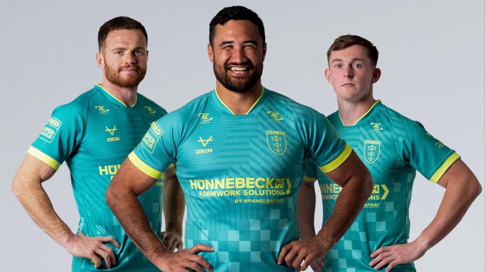
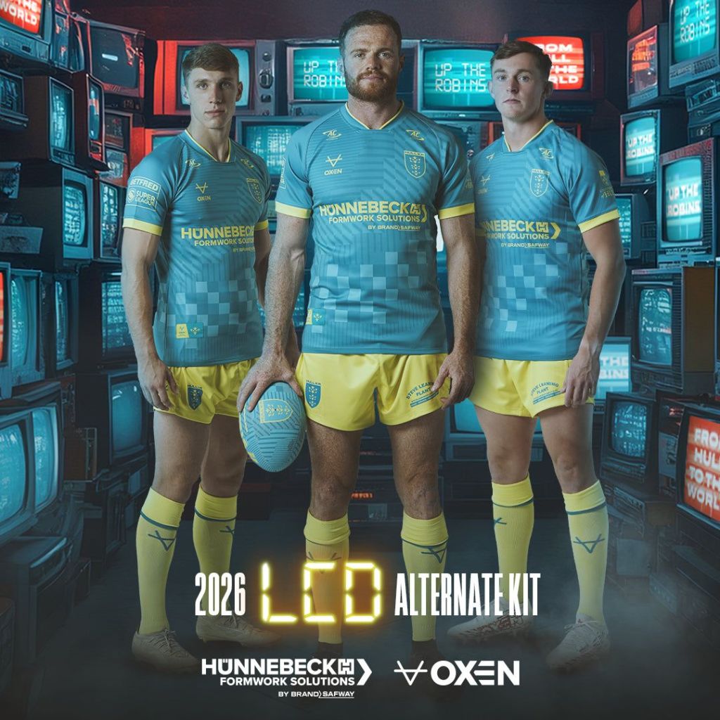
On Thursday 23rd October, Hull KR revealed their first alternate kit for the defence of their treble crown in 2026 – a teal and yellow kit with the moniker LCD – Liquid Crystal Display.
Once again they revealed a training range in the same design as a playing shirt ahead of the launch of the actual kit. This time, the LCD range features two training areas: one for individual player training and the other for the team of coaches and off-field staff.
The training range was launched ahead of the 2025 Super League Grand Final, on Wednesday 8th October. The yellow, teal and charcoal ranges are in parts, quite in your face, and whilst I sometimes like that about a range, this one doesn’t land a knockout blow on me like some have in the past. We can’t all love everything, right?
One thing that I did really enjoy about the training wear launch was the storytelling work done in the build-up to the full reveal. It told a great story about the groundbreaking work that took place at the University of Hull to bring success to the development of the liquid crystal displays, something which every single person in the world benefits from. The article post can be read here if you missed it.
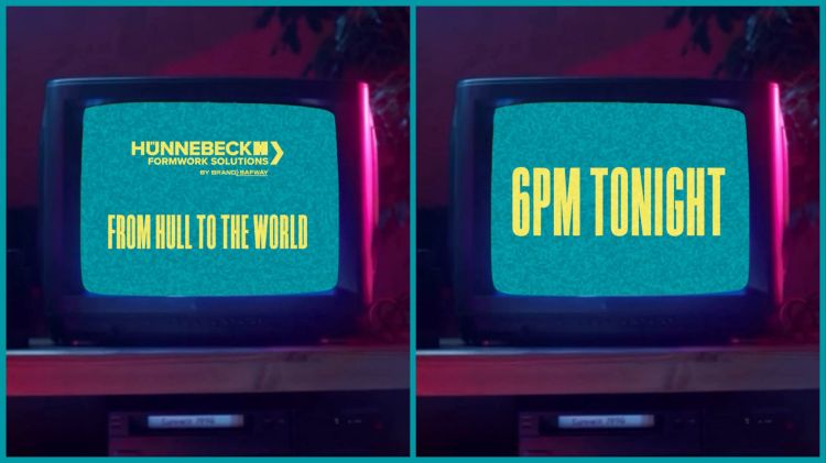
Moving back to the playing kit now, and it was announced shortly after 12:00PM that it was a reveal day, and just like the home kit, we were directed to LinkedIn to check out the first teaser. This is clearly the form of digital media preferred by Hünnebeck. The teaser was displayed on a pixelated TV, before showing Hünnebeck’s branding and the tag line “FROM HULL TO THE WORLD” and “6:00PM TONIGHT” – it was almost time!
The University of Hull, which is on board with Hull KR as a Platinum Partner for 2026, posted an image to their Instagram and Facebook accounts of their yellow branding on a teal coloured sleeve – this was to be the final tease!

As launch time arrived I was slightly nervous. I’m not keen on the LCD range training wear, and I was worried that the kit could harbour a lot of yellow. The yellow and blue ‘Icons of Hull’ kit from 2022 had a lot of yellow on it, and I thought that worked okay – but the more fluorescent yellow on the LCD players and coaches range is a bit more in your face, even by my pink kit-loving standards. My favourite item in the range is the teal coaches’ tee – something I will probably buy on the other side of the playing kit launches, past the odd bit. I don’t believe that it is a great range, personally.
Everything Everywhere
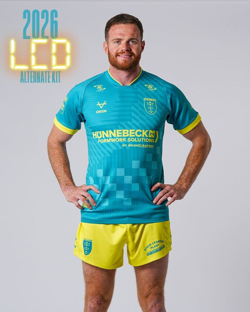
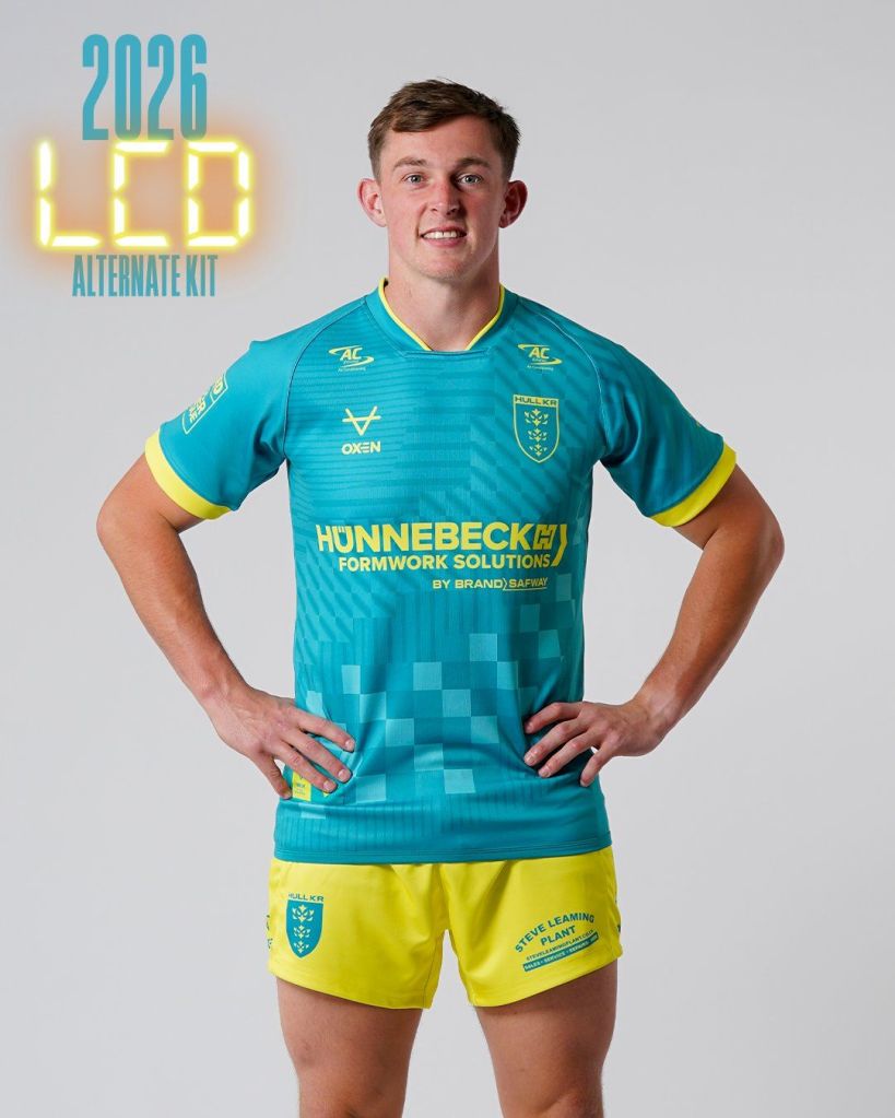
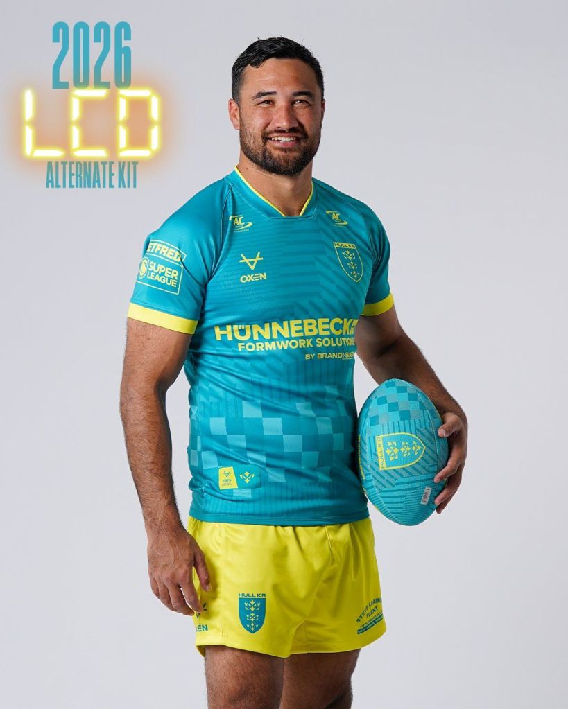
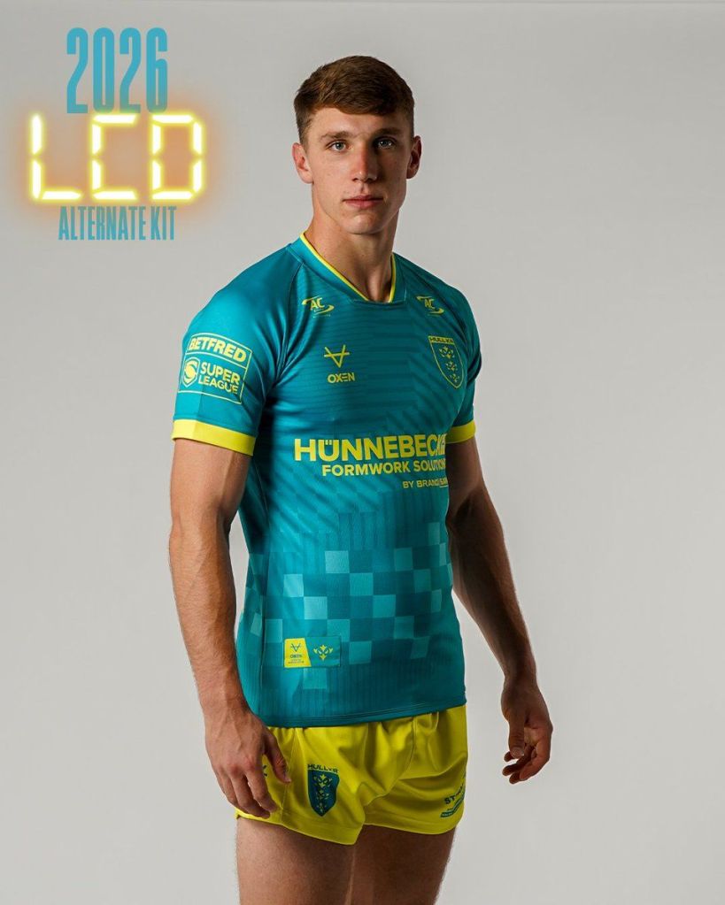
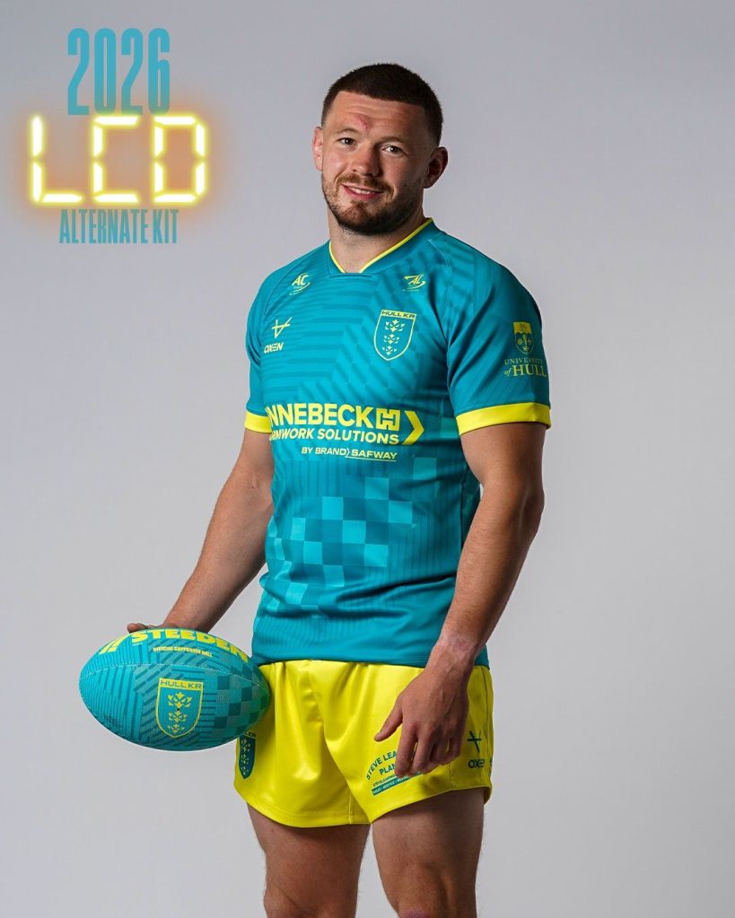
Thankfully, the LCD Alternate SHIRT itself wasn’t mostly fluorescent yellow – more on that soon – as the shirt is predominantly teal, with yellow sponsor, maker marker, club crest, collar/cuff detailing and the return of the usual styled jocktag.
The shirt design is made up of varying liquid crystal display elements, including cubes, bands and stripes, with what looks like static or white noise, minus the bands and possibly stripes, something I never expected to be happy about seeing on a Hull KR shirt! The main body colour is teal, but there are different shades used across the design to depict the LCD elements.
When I first saw the graphic for the shirt, I wasn’t wholly impressed, but that is because of something that I usually compliment Hull KR for, and that is showing the whole kit in their launch material. We went through a phase a few years ago of revealing a shirt, and not a kit. by showing a player in jeans and trainers, wearing a replica shirt. With the benefit of hindsight, I think this could have been a wise move for the LCD alternate shirt on this occasion.
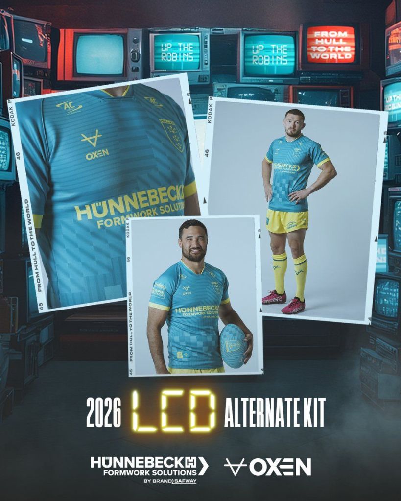
Something which I would like to point out, though, is that the shirt looks so much better in person and in the imagery on Hull KR’s retail website, compared to the launch graphic. I think it has been over-edited to show aged-LCD elements, which, let’s face it, is a great idea and ties in nicely with the story, but it really does take away the impact that the shirts have on the eyes. The kit appears a lot more faded than it does in real life!
Having said all of that, I do have to add… What on earth is going on with those shorts and socks?? They’re horrendous! Good friend and fellow kitgeek Les, of Hull City Kits reckons that they’ll grow on me when we see them in match action! I don’t question him on much, but this is one of those occasions!
There is a positive to come from this though. The kit is certainly different and unique. I have seen many people publishing their opinions about how they really like the kit, as well as others who just aren’t sold on it. For me, that is all part of the fun. Not everyone can like everything, can they? The engagement on my Facebook post about the LCD alternate kit saw many supporters have their say, and I enjoyed interacting with all the comments, which engaged me in conversation.
Being honest, from a retail perspective, the money for the club is in the shirt and not necessarily the shorts and socks. Not many people will buy the shorts and socks, some of those will include kids, lads who are stitching their mates on a stag do and full kit wan… Well, you know the rest. It might take a little bit of getting used to, but as long as the lads do the business in it on the field, I’m sure we’ll all overlook the colour of the shorts and socks.
Anyway, let’s get back to the shirt – if you think we’ve never used teal on a playing kit before, then you are mistaken. The main shade of teal used here is identical to that used on the 135 shirt that the Hull KR released as a third shirt in 2017 to celebrate the club’s 135th anniversary. A nice little tie-in and throwback to connect to the club’s extensive kit history.

Once again on the LCD alternate kit, the sponsor integration is sensational. Across the entirety of the kit, there are only two main colours used – teal and yellow. Each sponsor has been dye-sublimated in yellow on the multi-teal backing of the shirt. Hünnebeck (Framework Solutions By Brand Safway), AC Enviro, University of Hull, Harrison Solway and Connexin all deserve huge credit for allowing the manipulation of their colourways. As we saw with the home shirt, the shirt isn’t as congested with sponsors as we have seen in the past – something I think really adds to the desirability of the shirt.

One of the most unique things about the 2026 home shirt is the Red Robin 100 jocktag, but on the LCD alternate shirt, we see a return of the standard jocktag used since our switch to X-Blades in 2017. The not-quite-half-and-half yellow and teal fabric patch features OXEN branding and the Robin icon in alternating colours.
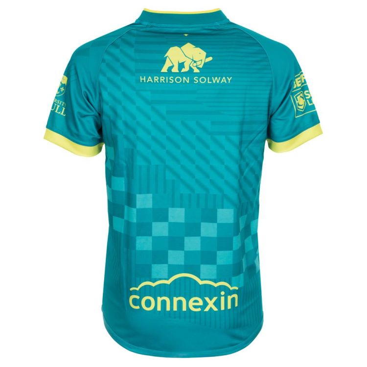
The LCD design elements continue on the back of the shirt, in an all-over print that mirrors the pattern on the front. Both Harrison Solway and Connexin feature in yellow – they have also been dye-sublimated in yellow to the teal shirt.
The shorts and shorts and socks are yellow. I’m not sure if that has been mentioned by anyone, though. Joking aside, the yellow shorts have the club crest, OXEN marker, Steve Leaming Plant, Westside Day Nursery and The Drain Company all dye-sublimated in teal. Unlike the home kit, the shorts don’t have a design on their side panel.

What else can I get?
A kit launch isn’t just that these days, is it? The LCD alternate kit has a whole load of other range items, too. There is a towel, baseball cap and bobble hat, a mug, hoody, cushion and the ever popular kit colour co-ordinated supporters ball!
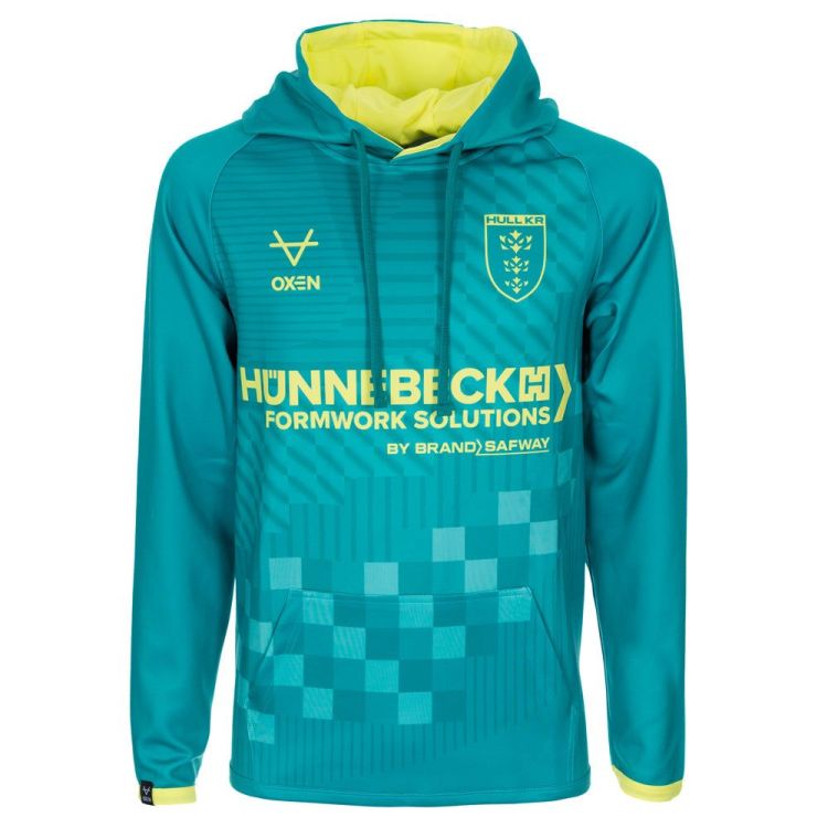
The one item that I would like to focus on in this review is the hoody. I wasn’t overly impressed with the 2026 home kit hoody. I don’t think that the design compliments it well, however with the LCD alternate kit that couldn’t be any more opposite! The hoody is a brilliant item. I can picture a lot of supporters wearing that in the pub, with a nice pair jeans and a fresh pair of trainers!
My opinion has changed since I have picked up my shirt. The colour is amazing, and the graphics really do not do it justice! I suspect the more that people that see this shirt in person, the more people will begin to like it – I know that sounds cliché, but it is true. It is so much nicer in person. Well, the shirt that is!
What is next?
We’re still awaiting the reveal of the second alternate kit ahead of the 2026 season, but what could that look like? I really enjoy putting shirts next to each other and seeing if I can guess what the next shirt could look like. The home is mostly white, and the LCD is mostly teal, so it leaves lots of different options. It could be dark, so navy is an option, but we have used navy every year since 2023 with the Diamond (2023), Marble (2024) and Navy Twist (2025). It could also be something different, like a return to grey? I feel we won’t have to wait long, as the third shirt launch in 2024, ahead of 2025, came on Thursday, 7th November, so I would put my bet on it happening at some time in the next 2-4 weeks.

Whilst you’re here, take a look below to see what else is happening at Hull KR Shirts HQ…


