Written by Mike Carter, Hull KR Shirts.
It is a little later than I originally forecast, but Hull KR have released their second alternate kit for the 2026 Super League season. I must say, I do think there was a very good reason for this, though, and I will share my theories with you as we progress through this review. Did they save the best until last? The early feedback which I have seen from the Rovers fanbase suggests to me that they have.
We had 24 hours’ notice ahead of the launch of the 2026 Red Robin alternate shirt. This information was ‘hidden’ in the sense that it was not directly promoted on social media. The information was placed behind the link shared to social media, which directed you to a statement on the Hull KR website. It might sound a bit daft, but not as many people as you would imagine actually click links on social media posts. That extra layer of friction can really slow down awareness of something, unless it is made really obvious. Within that was the ability to be able to pre-order your shirt to guarantee your polyester! Under normal circumstances, you probably don’t need to worry about this kind of thing… Unless you’re a Hull KR fan heading into 2026 – things are selling out left, right and centre! What a time to be a Red Robin, eh!
We know to expect further teases, and these came via the Clubs’ official channels, as well as on LinkedIn by Hünnebeck. Our first tease showed us that the shirt would have a similar sleeve design to the 2026 home shirt, with repeating ‘THE ROBINS’ flowing around each cuff. I’m a big fan of this, but understand that it isn’t for everyone. I do think I would have included it on just one of the three kits in the kitset though – it is quite a radical thing to do on multiple shirts. Further elements of the intricate feather design became more apparent after each tease, too. Even at this stage it felt like it could be an all-timer!
I actually posted something on social media that had been catching my eye. Across various uses of graphic design was a feather effect,. I first noticed it at the sponsors’ fixture breakfast, but that wasn’t a public event, so I didn’t say anything. Shortly after, I saw it on the fixture list the club posted to social media platforms – this time it was more subtle. It was also in the background on the TV screens in the Legends Lounge for Roger Pugh’s ‘The Robins: An Updated History’ launch, too. You’re welcome for the plug, Roger! However, it became mega-obvious to me that this was a hint when the club announced the squad numbers for the 2026 season. The full feather effect was visible here – we were onto something!
Something which has since been pointed out to me, which I missed at the time, was that one of the first uses of the feather effect design was tied in with the announcement that Hünnebeck was the club’s new front-of-shirt sponsor. It is almost impossible to see in the photography online, but I’m told that if you see it in person, it is much more obvious, so keep your eyes peeled for the wagon on those M62 journeys!

(Credit: Hull KR)
One thing that did catch me out was the story. When Hull KR revealed their home shirt for 2026, there was a focus on ‘Red, Red Robin’ turning 100 in 2026. Because of this, I completely ruled out the possibility of a Red Robin alternate shirt, even after clocking the feather effect. You know how people say when you’re close to something, you overlook the obvious? Well, here we are!
When the Red, Red Robin… 🎶

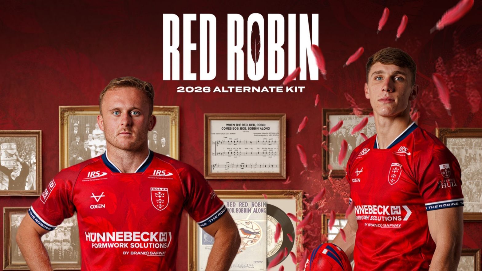
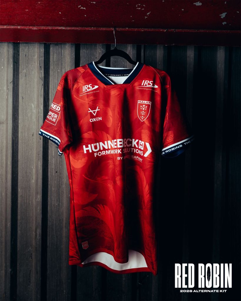
The full release came on Thursday 11th December at 6:00PM, a key time of the day for peak engagement via social media channels – modelled by Jez Litten and Noah Booth, the Red Robin alternate shirt blew up my timeline! The launch graphic is incredibly well thought out. My favourite touch is the gramophone, which has red feathers bellowing out of its horn – to the metaphorical tune of Harry Woods’ Red Red Robin, naturally! I should also give special mention to the Red Robin wall art and the feather cut out within the ‘O’ of Robin – lovely!
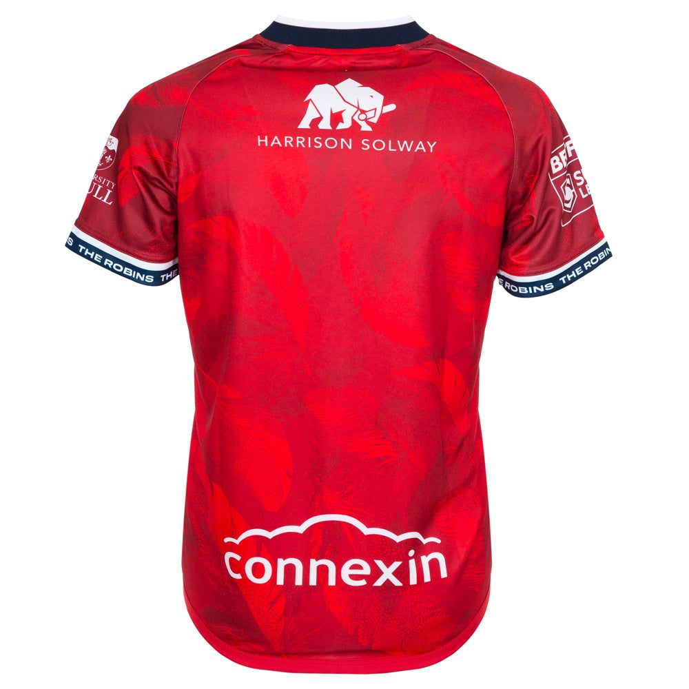
The feather effect, which was highly teased, is an all-over print, so it covers the entirety of the body and sleeve elements of the garment. The cut-off V-neck collar that features on both the home and LCD shirts is present here, too, as it is across multiple kits in the OXEN club pantheon in 2026. Making up the collar is a navy ribbed effect with a white layer all the way around the collar on the outside.
The sleeve cuff features ‘THE ROBINS’ word mark in white on a navy background, with a small white band above it which breaks up the navy from the red nicely.
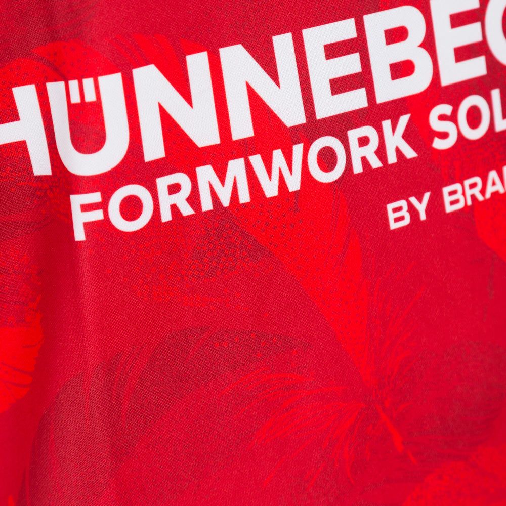
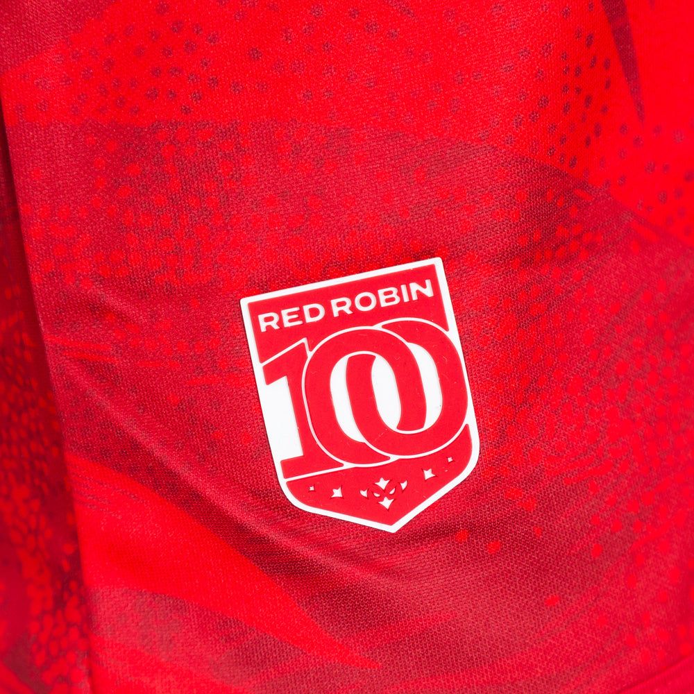
The front of the shirt features the Hünnebeck branding, in white, in the main front of shirt position – I’m not going to go to town on this again, since I’ve mentioned it twice already, but I really hope we see an element of change to their essay logo in 2027. Also in white is the IRS branding, and the OXEN maker marker. The Hull KR club crest has been embroidered in its natural colourway on the left breast, as wearing. The Robin100 jock tag that features on the 2026 home shirt also features on the 2026 Red Robin shirt.
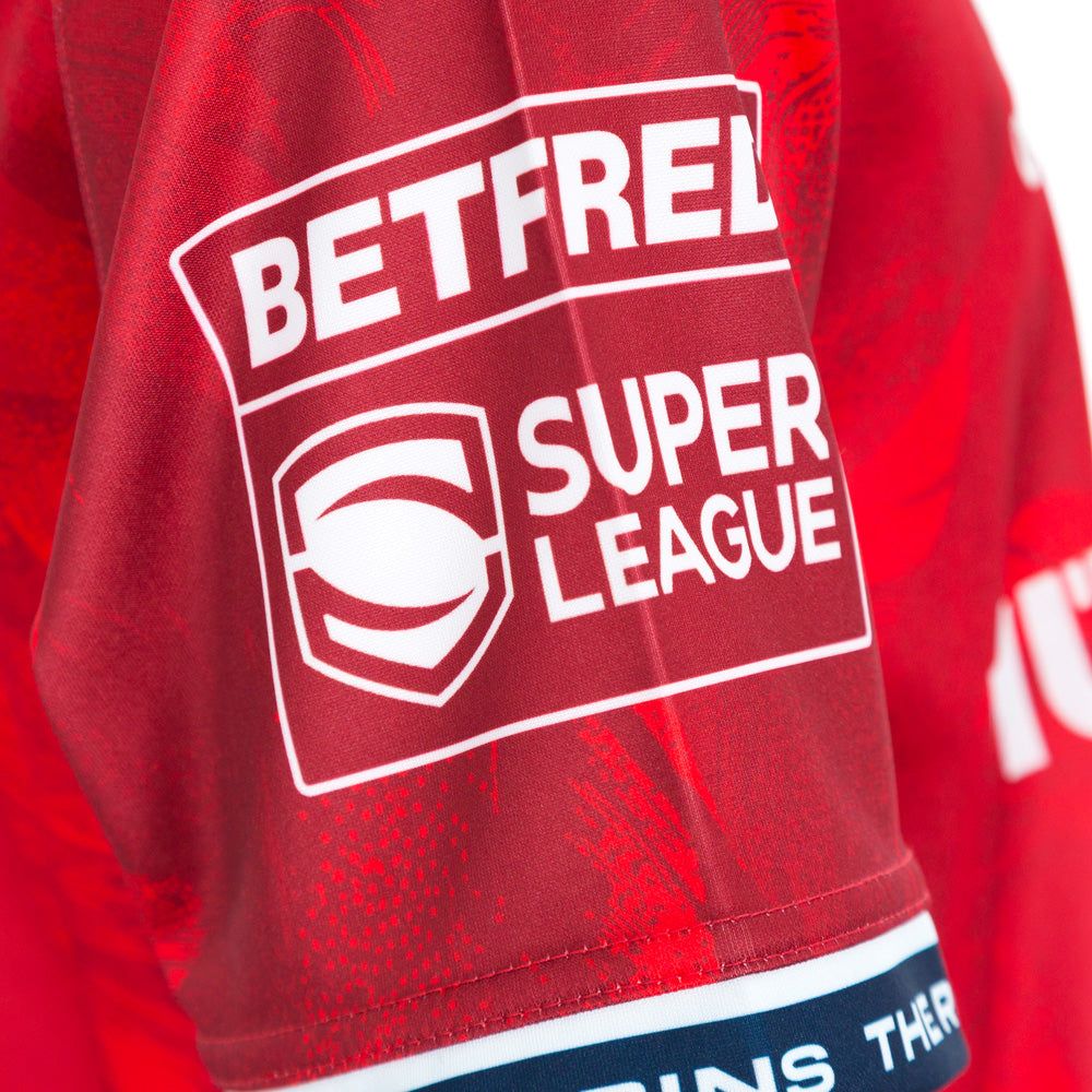
The left sleeve features the University of Hull branding, which has been dye-sublimated in white and on the opposing sleeve, we have a white monotone Betfred Super League competition logo – which has also been dye-sublimated into the shirt.

I have seen many people posting online and asking the question about the ‘Champions 2025’ competition patches that the players will wear in 2026. The 3 shirts for 2026 all went into production before the season-ending Grand Final, which is the reason why none of our shirts have it dye-sublimated in. If you recall back to the 2013-2020 Super League era (minus 2017), we didn’t have dye-sublimated competition patches because at the time of the shirt going into production, we didn’t know if we’d be playing in the Super League the following season for certain – just let that sink in for a moment… 10 years later, we went on to win it!
The back of the shirt is really clean. The feather design elements are all over the back of the shirt, with just the Harrison Solway and Connexin branding featuring in white. I would assume that the players will have their name and squad number applied in white to the back of their playing shirt. In the shirt photography is looks like the Robin icon hasn’t been applied to the shirt, but it has, in its usual position. There is just a misplaced crease on the back of the shirt.
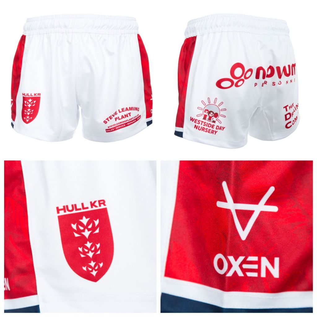
The 2026 Red Robin alternate shirt is complemented by white shorts and red socks with white and navy turnovers. The shorts have red side panels that house the feather design effect. White shorts are somewhat of a nod to the past. In 1983/84, we wore the now-famous red and blue shirts with white shorts and red socks, and I can only assume that this is a subtle nod to that. What does get me really excited, though, is the possibility of mash-ups… I’ll loop back to this towards the end.
Why was it later than usual?
In recent years, we’ve had all three kits revealed before the end of November, but that wasn’t the case in 2025, ahead of what is destined to be a busy 2026. The last time we didn’t have all three kits out before December was in 2021, ahead of the 2022 season, as we revealed the 2022 alternative Boilermakers kit in April 2022. Before that, there were some logistical issues surrounding the launches ahead of 2021, too.
I can’t be certain, but I think the ‘delayed’ launch was more around choice, and no other reason. The kit is an all-timer, and I think the club correctly projected that its reveal would be well received by supporters of the famous Hull KR, meaning that no matter when it was released, it was going to sell incredibly well. The club has been drip-feeding Vegas merch for the last few months, with quite a big drop landing over the last few weeks. Vegas merch has a shelf life, too. The game is fast coming around, and selling as much as possible ahead of the stateside trip feels vitally important. For that reason, I think the launch was tactical. It allowed enough time for people to pick up the Vegas merch ahead of the launch of the Red Robin alternate kit. Just in time for the big fella to bring it for Christmas.
“The Fastest Selling Hull KR Shirt Ever!”
We’re living in a world where Hull KR are must-see and everything is becoming like rocking horse, you know what! The Red Robin shirt became the fastest-selling Hull KR shirt ever in the first 18 hours after launch. One really impressive thing, though, is that at the time of writing, none of the sizes have yet to sell out, which tells me the club correctly forecast this shirt to be incredibly popular when placing their initial order in mid-2025. If you want one, I’d recommend purchasing one sooner rather than later as the projection to sell out is clearly inevitable!
There is a slight elephant in the room with the Red Robin alternate kit, and that is that it is somewhat reminiscent of the England poppy shirt that the national side wore against Australia in the third Ashes test. The thought came to me right away, but it was Steve McNichol (Cas Rugby Shirts) who mentioned it to me directly first. I think it’s obvious that there are some serious similarities between the two, which isn’t necessarily an issue – it just is what it is. I would put my entire shirt collection down on a bet that our shirt was first into production, though, not that it really matters.
The Kitset as a trio…
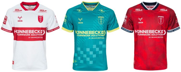
When you line up all three kits side by side by side, it is easy to assess how much they complement each other. The trio is similar to that of 2019, when our home was predominantly white, with a blue away and a red third kit. That trio is in the top 5 of the Hull KR Super League era, IMO. When playing away from home, there isn’t a club that we will clash with, which is always the primary aim, closely followed by aesthetics.
The home kit has red shorts, and the Red Robin alternate kit has white shorts, which gives us incredible interchangeability if we fancy it! I’m down for some cool kit mash-ups in 2026 – cheers for the phrase, Les (@HullCityKits).
The one mash-up that interests me the most, though, should be seen in Las Vegas. I would like to see the white Red Robin shorts, with the home shirt and socks, in a one-time use of this kit. The Robins in all white, exclusively for Vegas? Sign me up!!
Whilst you’re here, take a look below to see what else is happening at Hull KR Shirts HQ…
