
Written by Mike Carter, Hull KR Shirts.
In a reveal that was delayed by 6 months due to the COVID-19 pandemic, Rovers fans finally got to see what was initially planned to be the charity (or third) shirt for 2020. The plan to release the shirt was delayed by the pausing of the Super League season in March and has now seen the shirt revealed as a 2020/21 charity shirt, the first time a charity shirt will span over two years. The shirt will be worn by the first team in Super League against Hull FC in October 2020 and again at the Magic Weekend in 2021.
The launch was once again built off the back of a very effective digital marketing campaign. We didn’t know it at the time, but the ball got rolling on Thursday 1st October when Harrison Solway was reintroduced as the main shirt sponsor for the 2020/21 charity shirt. We already knew that Harrison Solway was going to be the main shirt sponsor, so this wasn’t new information to the Red Army, however, the information regarding the shirt spanning a second year was.
I was slightly concerned on Thursday evening when we were told the shirt would be purple. We have a lot of purple around the club at the moment with the Stadium being sponsored by Hull College, and it did concern me that it may be too much in one go.
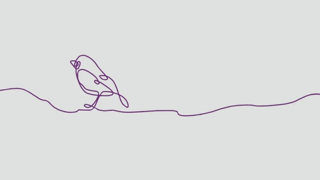
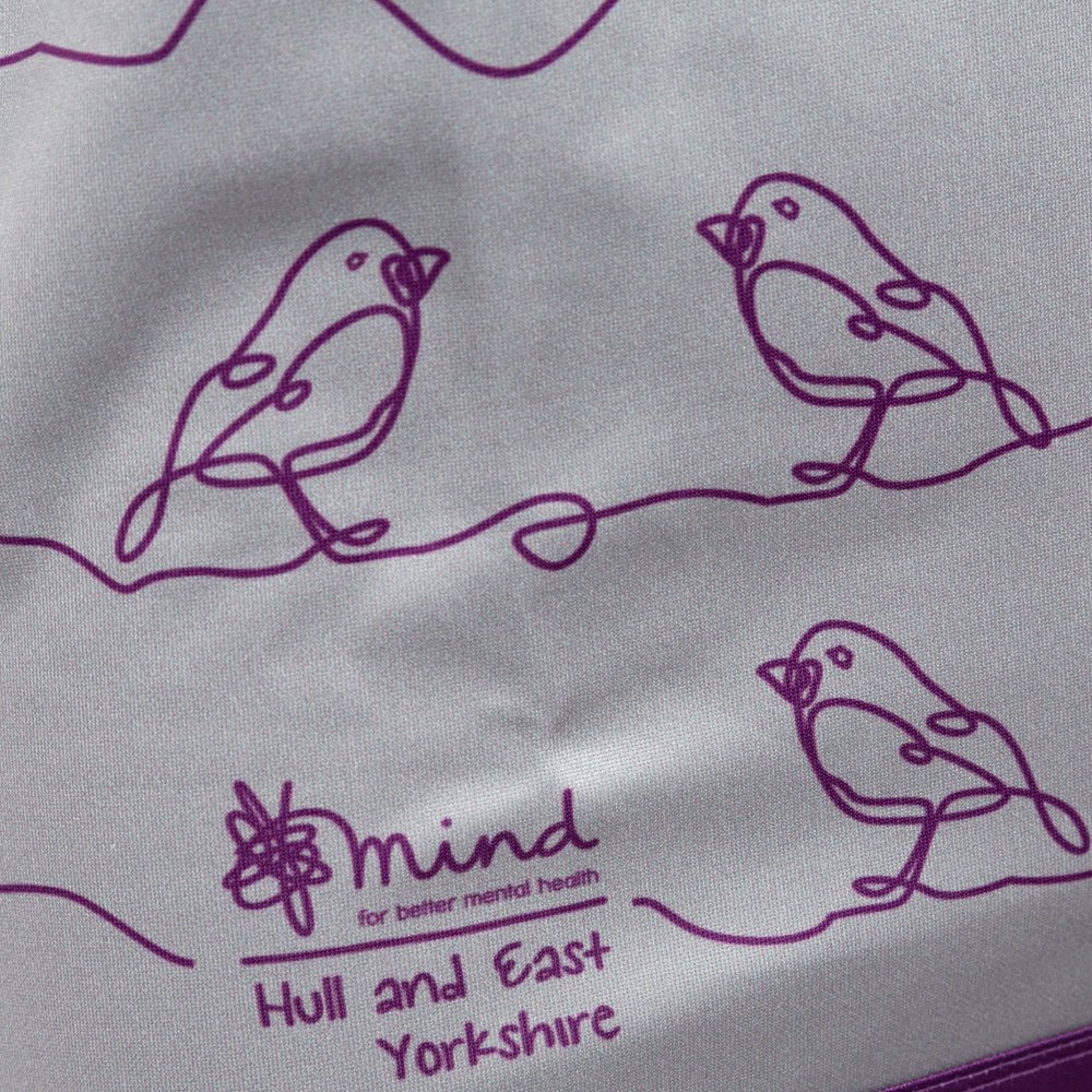
On Friday morning a video came and revealed some Robins within a ‘squiggle’ which resembles that used by Mind. At this point we still didn’t know we were being graced by a shirt reveal day, we were only able to guess. You can see the video here.
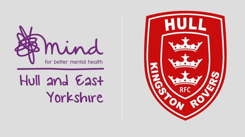
The next clue came in the way of Mind: Hull and East Yorkshire being announced as the Clubs charity partner for 2020/21. The graphic used had a light grey background, the same as the video of the Robin, a nod to the main body colour of the now 2020/21 charity shirt. Who else spotted this at the time? You can read the joint statement here. It was at 12:00 pm when confirmation came that we indeed were having a kit launch at 7:00 pm.
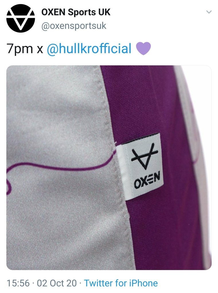
Our first glimpse of the shirt itself came at around 4:00 pm, courtesy of Oxen Sports. It was a close-up image of the manufacturing tag that graces all Oxen replica shirts. It revealed the main body colour to be grey with purple side panels.
Now we’re able to visualise what the shirt is going to look like. This builds up a new kind of energy and excitement to see the full product ahead of its reveal. The shirt was available to order before its revealing and social media was filled with screenshots of fans showing their support to Mind and Hull KR by purchasing the shirt before the full reveal. This was a great marketing move to capitalise on the interest generated by the online reveal campaign.
Next, we were shown the shorts and socks. The shorts are purple, which matches the side panels of the shirt. The socks are also purple but they feature a grey turn over. Aesthetically this breaks up the purple and is a nice addition, in my opinion.

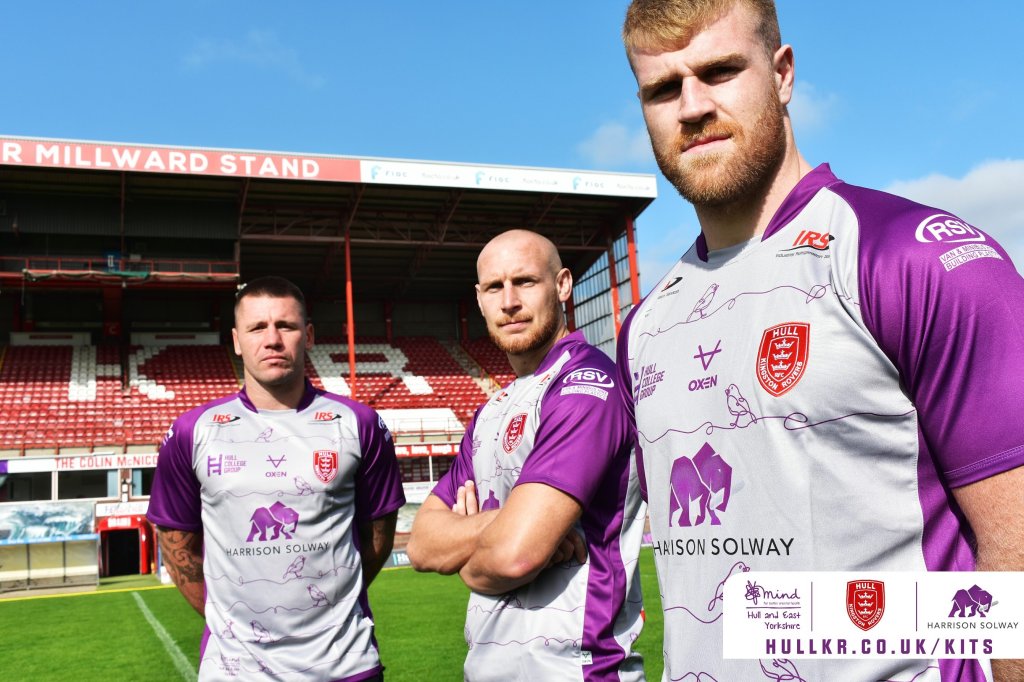
Now that we’ve covered the build-up, let’s get onto the kit! We’ve got a grey and purple combination going on. It’s the first time we’ve seen purple on a Hull KR kit since our 2015 away shirt, that was released in line with the bid for Hull being the UK City of Culture.
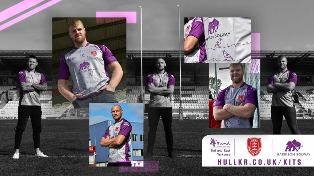
I am a huge fan of the Robins within the ‘squiggles’ on the shirt. The thought and the attention to detail that has gone into this are fantastic. This alone delivers a connection between Hull KR and Mind. The Mind ‘squiggle’ is one that is recognisable and the addition of the ‘squiggle’ to the shirt truly makes this a Hull KR and Mind charity shirt and not just a Hull KR shirt for a charity. It adds to the values of the shirt and delivers meaning that everyone can relate too.

The addition of Harrison Solway’s branding as the main shirt sponsor fits with the aesthetics of the shirt. It doesn’t stand out like a sore thumb, unlike the Hirebase on the reverse. The branding of Hirebase doesn’t fit well with the colours used on the shirt. I feel this has more to do with the size of the branding than the colour, as the IRS branding and the club crest doesn’t leave me with the same feeling.

I am purely judging the shirt on its appearance. I don’t have to answer to or accommodate businesses and their branding on a shirt; however, I understand why it appears this way. Sponsors are vital to the club operationally, and sometimes it just has to be this way – even if it doesn’t look great to supporters.
On the other hand, credit should be given to RSV and Easy Buy for allowing their branding to appear in white on the upper arm sponsor positions. The fact these are matching in colour makes them much easier on the eye and gives the shirt a symmetrical feel. A change to the usual branding of Compass Academy also ensures their logo is a natural fit on the shirt.
The addition of the Mind: Hull and East Yorkshire branding just finish the shirt off nicely. It’s great to see the club supporting a local charity, and not a national one. Community is such a big part of Hull Kingston Rovers and being able to support and make a difference in that community is a pleasure.
I’m glad that we got to see the full kit on the launch, even though the shorts and socks weren’t modelled, it gave us the ability to picture what the kit would look like. Hadley, SKD and Murray modelled the shirt in casual jeans. This was a smart move, in my opinion, as this is what a fan would likely wear with the shirt and allows them to picture it better.

My overall opinion is that I like the shirt, but I wouldn’t say that I love it. I do love the idea with the Robins in the ‘squiggles’ though. I feel it gives the shirt a piece of real character and a link between the club and the supporting charity. It most certainly isn’t our worst third kit in recent times, but I wouldn’t say that it was the best either. An opinion can change when you see the team playing in it, so I do reserve some judgement for that. The shirts the lads’ modelled for the launch are the replica version that we as fans buy. It gives us an insight into what we’re buying, which is good. I’m looking forward to seeing how the look changes when we get to see the player spec version in the near future.
The fact the shirt is being used over two seasons means that the plan for 2021 is to run with this shirt along with a home and away strip. That means over the span of two years we will see 5 playing shirts used, one less than we’ve been used too. This is another sign that the club means well with being realistic with their supporters’ finances by not releasing 4 or 5 playing shirts like some other clubs. Personally, I’d be okay with more shirts, but I also understand the pressures that come with buying and collecting shirts.

To close, and for what it’s worth if anyone noticed, the charity shirt was priced at £48 this time around, the same as the home and away shirt, and not the usual £50 we’ve become accustomed to. It may only be a small gesture from the club but it isn’t one that went unnoticed with me. Also by carrying the shirt over two seasons, it will allow for more longevity in the shirt for supporters, that will hopefully allow us to wear them on the terraces in 2021.
